For Events, Why We Live Here Series, What Sold, Company Updates and more . . .
Browse Delaware Communities
Sold Properties in September 2017
Home Sales in Southern Delaware
Land Sales in Southern Delaware
- Rehoboth / Dewey
- In-Town Rehoboth*
- Lewes
- Milton
- Millsboro
- Bethany
- West Bethany
- Southern Sussex
* Info. from the Sussex County Association of Realtors MLS
Monthly Trivia

Why We Live Here . . .
A Popular Photographic Series provided weekly on our blog at SellingDelawareHomes highlighting attractions, history and interesting places here in the beach area of Southern Delaware.
Market Activity for September:
As of the end of September, there were a total of 2,165 homes on the market, a decrease of 1% from the previous month’s end inventory of 2,187. This represents an 8-month’s supply of inventory, with a current absorption rate of 282 homes sold per month thus far in 2017.
Closed Sales
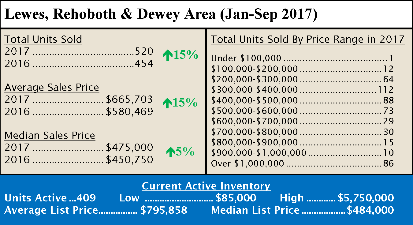
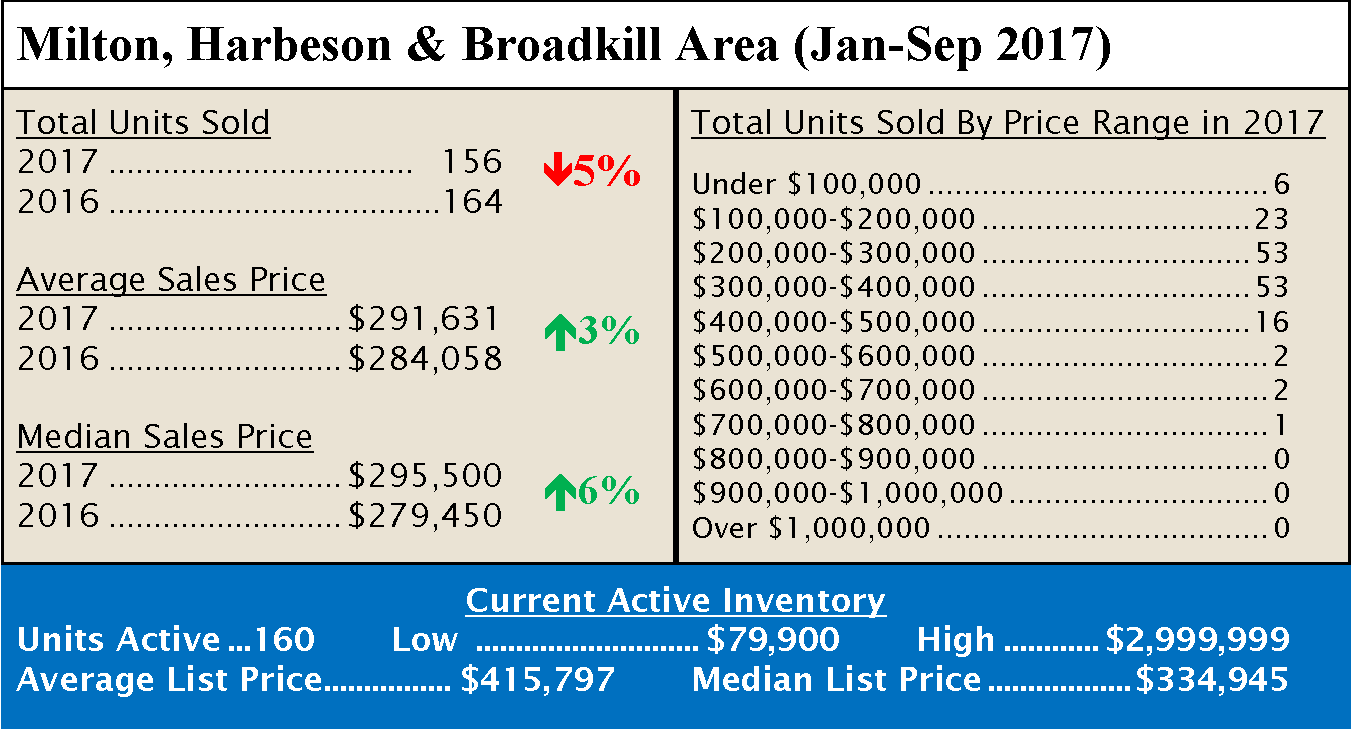
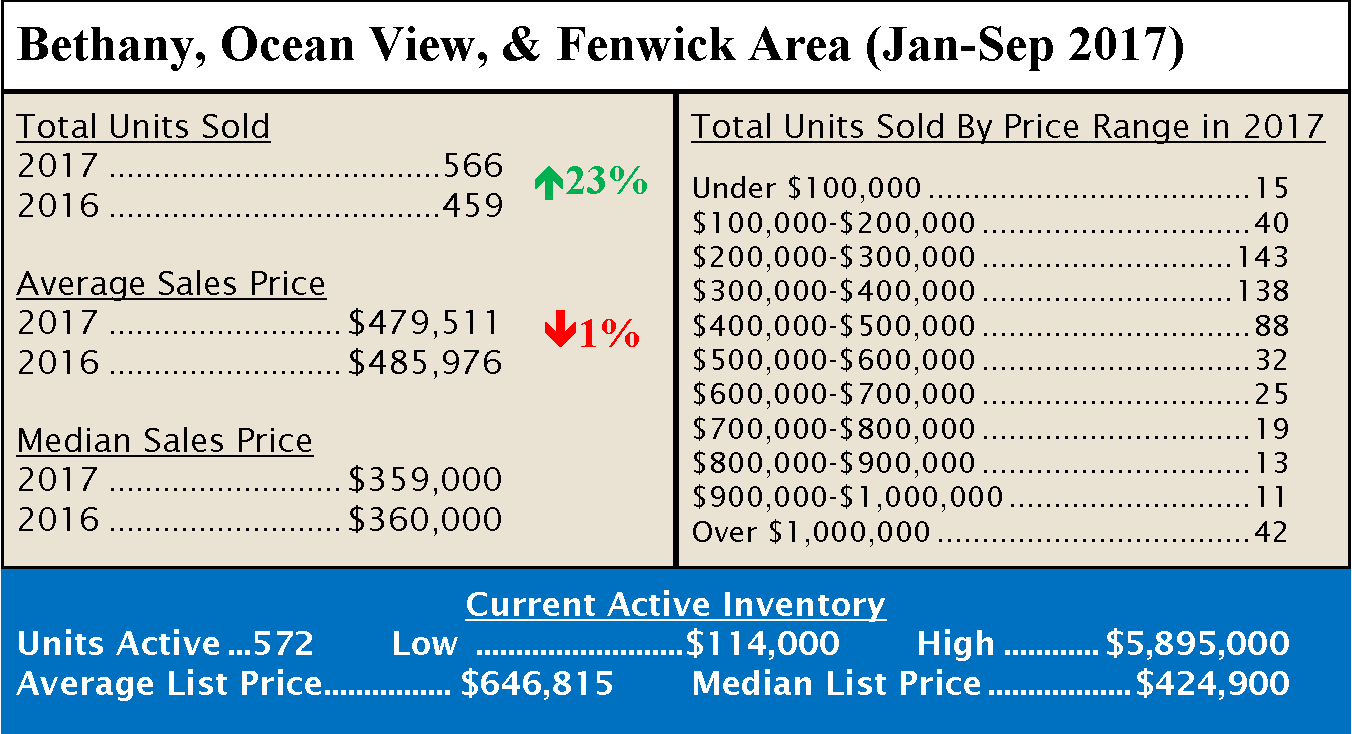
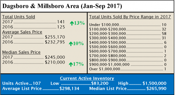
For the first 9-months of 2017, sales of single-family homes in Sussex County are up 17% over last year, with 2,542 homes sold compared to 2,174 for the first nine months of 2016. The areas with the largest increase were the Angola/Long Neck/Millsboro, up 24%, and the Bethany/Ocean View/Fenwick Area, up 23%. The area with the largest decrease is the Milton/Harbeson/Broadkill Area, down 5% from last year to date.

Choosing Colors for Your Home
If you’re not sure what colors to choose for your new home, here’s a simple rule that may help: The closer a color is to brown or grey, the more neutral it is, which is why whites, greys and beiges tend to be quiet and conservative. The closer the color is to being primary, the more stimulating it will be, like red for dining rooms to stimulate appetites and conversation.
The important test when choosing colors is what effect you want them to have. Do you want your home to be calming and relaxing or energizing? Preppy or boho? The more neutral you go, the more you want to pump up textures. With more color, smoother textures work better. Add drama with color opposites like black and white, or blues and yellows. Purples and greens lend a subtle suggestion of luxury in deeper shades.
Consider colors that were used when your home was built, such as teals and pinks for the 50’s, earth tones for the 70s, or jewel tones for the 90’s. Picking colors found in a favorite rug or painting can also work. Choose the most neutral color for large areas, and save the brighter colors for accessories. You can also bring in more color with dishes and glassware.
Start with a light, neutral tone for the walls and carpets. Larger pieces of furniture like the sofa and chairs can have a little more color but save bright color accents lamps, pillows, and bedding.
